Step 1: The design journey begins
It is without question that the Covid-19 pandemic has affected virtually every aspect of human life. Determining the existence and extent of cause and effect is challenging and complex; therefore, we approach the problem with visualization: We can show relationships with Covid-19 and human life indicators over time and across locations.
Our objective is to use trends in mobility and economic indicators to visualize the changes in human activity over the course of the Covid-19 pandemic. We first propose several ideas:

Plot of Covid-19 severity: Regulations for human mobility are enforced when the Covid-19 pandemic is most severe. We can visualize the severity by showing the proportion of the total number of cases, hospitalizations, and a number of critical cases. This can provide a clear picture of the severity of the spread of the pandemic across different fixed time periods. The idea would be to link severity with human mobility.

Cases vs Hospitalizations across municipalities: A 3-dimensional bar plot showing the cases and hospitalizations across different geographical regions can help understand at a glance how severe has the spread of the pandemic been across small geographical spans. It can help generate actionable insights at a granular level. The idea would be to show relationships between mobility and Covid-19 cases, visualizing how the pandemic spreads with people.

Calendar plot of vaccinations and active cases: A bar plot per date block can be shown to show how the number of vaccinated people and the number of active cases vary across different days of a month. This plot can help provide actionable intelligence to understand if vaccination drive is to be increased at a certain period to mitigate for growing active cases.

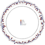
Cases per province in a country: In order to create a high-level visualization to understand how are the Covid cases in a country spread across the province, a plot of the shape of a flower has been proposed where each petal of the flower would be representative of the total number of cases in a province at a given time frame.

Entity-relationship plot for contact tracing: Contact tracing has proven to be one of the workhorses of mitigating the rapid spread of a virus. A number of mobile applications have recently surfaced in the market that can help contact trace but it is essential to have an overall visualization of how an infected individual can spread the disease to others. An entity-relationship plot where each node represents an individual and each edge represents action points or facts like being tested positive for Covid can help contact tracers understand the social bubbles better and hence create a better response to outbreaks.
Thereby combining the results of the group thinking exercise, our team has decided to base the project on the following primary research question:
How are human mobility and economic indicators linked to the spread of coronavirus? Is an epidemiological crisis more than ‘just’ a health crisis?
The story that our project aims to tell has three primary aspects that the team is trying to connect via a visual story. The three primary aspects of the project are:
- Rising COVID cases;
- Changes in mobility;
- The resultant economic fallout.
It must be noted that one of the most characteristic policy interventions to rising COVID cases across the world has been to impose lockdowns which simply means that mobility in our daily lives has been brought to a minimum. Reducing mobility has definitely reduced COVID cases but it has most always come with economic consequences. Thus, we aim to tell the story of rising Covid-19 cases and connect it with mobility and related economic impact. In order to demonstrate the idea, we aim the describe the project using the following visual mockups:
The global views:

In the above mockup, the figure on the top left shows the quarter-by-quarter change in mobility and Covid-19 cases. The size of the mark has been used to determine the cases and the color shows the average change in mobility for the specific quarter. In this specific case, the visualization shows the average change in mobility to retail and recreational destinations for each quarter. The same can be compared with the change in GDP figures for each quarter in the bottom left visualization. The same visualization can be repeated for a number of other mobility-related variables.
The local view:

From the global view, the objective is to zoom into a local view. In this project, the team has chosen to tell the story of New Zealand in the face of the pandemic, and as such, the objective is to come up with a province-by-province comparison of the average change in mobility per quarter along with cases, the same can be compared with changes in GDP in the country for specific quarters. The objective is to extend the local view into demographics as well where the changes in mobility, cases across different demographics can be studied as well.

Conclusion: The primary objective of the project is to create a visual story of how changes in mobility as a policy (non-pharmaceutical) intervention affected the spread of the Covid-19 pandemic as well as the economy. Further, the objective is to create a visual story at a granular geographical as well as demographic level exploring the growth of cases and the changes in mobility.