Step 3: Plunging into the Design
For professional statisticians, it is very easy to approach each and every dataset with a certain knack to want to badger the numbers until you find a relationship. It is quite tempting upon glancing over a data frame — not asked — to already begin a statistical exercise with a certain hypothesis in mind.
However, as creative designers here, we needed to abandon the statistical thinking of hypothesis testing quintessential for anyone who’s been trained in the Data Science field. Moving away from the natural tendency to search for relationships, we let ourselves be taken by our data on a journey without consciously planning the destination in advance. Nonetheless, we had a general idea where to head, roughly speaking, since the direction of the compass was somewhat important to guide us in the research question.
As mentioned in the previous posts, setting the stage for the design session, we set our creativity in motion, with the question in mind whether a health crisis is an economic crisis as well and/or tantamount to a mobility halt.

Even if you let the “data speak for itself”, it’s good to start from somewhere. We thought starting at the higher-resolution would make most sense and then zoom into the more granular levels of each dataset, i.e. mobility, economy..
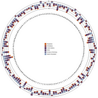
To view the entire design space board, please visit the following link. There, you can find our mind map from the beginning of the creative process. We thought we would show a spinning globe of the world in an interactive mode, where the countries with highest mobility reduction are shown in a flashing manner consecutively, followed by changing corona virus cases and economic indicators over time — at a national level, zooming into the local level.
Actual Design Session
For the actual design session phases — diverge, emerge, converge — we utilized a different board, which can be accessed here. On the fifth board from left to right, entitled Data Vizers, you can see different steps separated on three mini horizontally stacked boards, where different ideas were explored by sketching whatever comes to mind and allowing for some “wrong” or illogical ideas.

Diverge — we loved this phase!
Sometimes we are hampered by the notion how things are supposed to be. In this phase (diverge), we let our minds wander outside the box, although at times we felt constricted ‘in the box’ by our own selves (see first top board).

Emerge — that’s where creativity and thinking was allowed to merge!
In the next stage (emerge), we searched for commonalities between ideas and graphs; give voice to some elements in the thought process to complement each other or allow for combinations that are counterintuitive in a reverse manner. As a check to the design theory, we went through the recommended list of milestones for this phase (substitute, combine, adapt, modify, eliminate, reverse, etc.) to make sure we were not floating on the design surface and explored various options. Finally, in the end stage of this process (realizing it is hardly really the end), we tried to eliminate parts of the blueprints that might not work either because of being unrealistic or not fitting our data storyline very well. In general, communication was key in aligning the thought process but also some graphs let us know that they should be the winner in this phase without the need for too much thinking on our part.
Converge — beauty cannot be forced and will shine on its own…
One example from the converge phase that could be carried forward is:

Applying mentally the logic of the reverse idea of the emerge phase, this is as we know it, not the beginning of the end, but only the end of our beginning!
Thank you for reading our post!