Step 5: Making Ends Meet..
..or meeting the end.
Hello dear reader,
This may be the last post of ours you read so we decided to make it more personable. Personalized medicine, personalized ads, you get the idea.
As a reminder of what our project was about, we set out to show the changes in mobility at the onset of the COVID-19 epidemic and its progression on a global, national and regional level. Next to that, we added the idea of also showing changes in diagnosed cases throughout the pandemic. And to make it more holistic, we wanted to include economic indicators, if available.
Building upon the previous post, where we gave you a glimpse of our DDDs (dynamic digital drawings) that resulted from our initial deployment, here we will show you some more DDDs that came out of further deployment efforts.
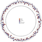
You might remember that we scrapped the idea of retaining DDDs of world flights before and after the epidemic onset due to the busy-ness created for the eye and moved on to the globe rotational DDD. In addition to that, we have another new DDD to present on the global level and namely, a radial bar chart showing the daily averaged changes over one year (from March 2020 to March 2021) for every country. We aim to implement a selection box where this graph can be customized based on users’ input.

If you got lost in the details, let us guide you through the graph and point out the most striking feature: If you look at the 0 radius, you will see that most countries show a decrease in mobility in all areas of life, i.e. Residential, Workplaces, Transit stations, Parks, Grocery & Pharmacy, Retail & Recreation and probably other categories that we don’t have data to show you for. Each bar stands for one country labelled in the legend. The user can specify which countries are of interest and pre-select or limit to for a better view. We decided to show all countries of the world for a more global view. There are but a few countries in the whole spectrum, which did not experience a decline in the movement of persons. We can speculate that these countries might be those that were not yet hit by the coronavirus epidemic or not yet to a large extent.
It is time we move away from mobility and show you some data on COVID. The following DDD expands the earlier calendar heatmap we had shown you by adding the extra elements of new cases or deaths registered in a country. The country can be selected from a list of country names in the dropdown menu and the new cases or deaths linked to COVID-19 can also be selected. We tried to align the time scale of the calendar presented in a previous post, showing changes in mobility for a given country for different mobility categories. As for COVID, one can also select new tests and positive rate.


While it is difficult not to associate decline in mobility with a decline in positive registered cases of COVID-19, we know from experience that the very nature of restrictions imposed by different governments to curb the epidemic is causal and the inability to make contact with one another reduces the likelihood of viral transmission from one human host to another. Therefore, we can safely assume and conclude that the imposed restrictions in mobility produced a favorable effect and vice versa, the relaxation of measures, as seen in the summer months in the Bulgarian calendar above, marked in brown, facilitated the growth in the epidemic wave observed in November. Hence, we can also understand the reduced mobility that followed in December 2020.
The next item of digital deployment success was the parallel lines plot, which we plan to adapt for economic data on the regional level for New Zealand. For now, we present the plot in its preliminary format, which allows to fit data for distinct indicators, represented by each vertical line, on a country level here.

The time range can be selected from the dropdown menu and adapted according to the interest of the viewer. Despite the within-country variability for a widely selected range, say March till June 2020, the mobility patterns seem to follow a grouped trajectory for each country, as shown by the stacked lines color-coded for Belgium, New Zealand and US above. A similar plot can be deployed for an economic indicator, such as unemployment rate, and each vertical line can represent a different region within a country. Depending on data suitability, we plan to implement the parallel lines plot to demonstrate the regional variation, if any, for employment levels within New Zealand next.


We in the DataVizers team hope that the above was not too confusing and gave you an idea of how one can utilize different graphing tools to showcase complex data in an interactive and somewhat intuitive manner. While we realize that giving snippets of our work here and there might not convey the story that we had in mind in full, we hope it gives you a snapshot of the big picture and what can be done by the user of these visual tools in an a la carte mode, meaning in a less traditional or static and a more dynamic way.
Using features from a dropdown menu allows the researcher as well as ordinary citizens to create their own story or personalize their data extraction on as-needed basis and democratizes the data science process in our opinion.
Aware of limitations, such as lack of data, synchronizing disparate time scales, visual imperfections in our DDDs or missing elements from the story, we welcome your feedback on how we can improve the storyline further.
Yours sincerely,
DataVizers Staff Editor